
52 Boxes In 52 Weeks, The Taunton Press, $24.95, 224pp, May, 2018
Full disclosure: I was given a copy of this book by the publisher for review.
This is a wonderful design book by Fine Woodworking senior editor Matt Kenney. It's the result of a challenge he set for himself to practice his design skills: design and build a small box every week for a year.
The boxes are largely simple in construction, using a limited set of techniques, since the construction process was not the main point of the exercise. Instead, he explores a wide range of shape, proportion, materials, and decoration.
The idea is that like any other skill, practicing design allows you to refine it, analyzing what you like or don't like about each iteration. That also broadens your perspective as you explore the limits to a wider degree than you might otherwise.
The end result is a collection of boxes with different appeal to different tastes. Reproducing these boxes would make great gifts. They are beautiful, with a clean, spare design.
But more to the point, Matt wants to encourage you to explore your own design space. This was his result, his personal aesthetic. Yours may be different.
Design Principles
He follows several design principles, outlined in the introductory chapter.
First is proportion. He says this is critical. Good proportions result in intuitive beauty. Poor proportions can turn even the finest project clunky.
Second is simplicity. These are not heavily adorned. He limits them to just a few distinguishing design elements.
Third, he ensures that all elements are in proportion to the scale of the box.
Fourth, he develops the details, thinking about every little one from the joinery to the widths of rabbets and the amount of shadow line and reveal.
Fifth, he chooses the wood carefully, including its grain and imperfections. Every little knot or wave in the grain is meant to be where it ended up. Design is intentional, not accidental. Wood is a natural medium with natural variation. The design challenge here is to make use of that variation.
He further utilizes the grain by making it continuous all the way around each box. That provides a natural flow and continuity rather than a jarring transition. Achieving continuous grain is one of the few technical descriptions in the book.
Sixth, he adds a small degree of color. He uses milk paint to add to the natural wood color, sometimes harmonizing with it, sometimes contrasting.
The book itself follows this. The various page elements adorning the text and photos pick up the color flash of each project.
These provide the parameters for the variation in design.
Techniques
In general the construction techniques are simple, but a brief chapter on box-making techniques details the following:
- Resawing to achieve continuous grain.
- Crosscutting and mitering.
- Lids that don't need hinges.
- Stable bottoms with various decorations.
- Finishing with shellac and milk paint.
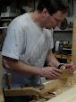
One thing to note is that these are mostly small boxes in thin stock, so the work requires precision. I had the pleasure of watching Matt work on several of these when we happened to be demonstrating at the same Lie-Nielsen Hand Tool Events. Watching him fit the joints and dividers, carefully shaving them on a small shooting board, was fascinating.
Building boxes like this will not only improve your design skills, it will improve your fine hand skills.
The Boxes
The remainder of the book shows several pages on each box individually. Matt describes what went into the design and what he was trying to explore with it, then describes how he constructed it.
This portion of the book opens with a two-page spread showing all the boxes. It's especially nice to let your eyes range around this layout to compare the variations. Different things will jump out at you.
There are flat boxes, wide boxes, short boxes, tall boxes, divided boxes, stacked boxes, and boxes with drawers. Each features just a couple of design elements of color and fittings.
My favorites were the divided boxes. I like compartments. I guess they appeal to my sense of organization.
It's interesting to come back to this spread after having read through all the box projects individually. That changes what jumps out at you.

One of my favorites, a flat divided box made primarily of cherry, with a green milk-painted lid in the center.
As Matt notes, the idea of the milk paint and fabric may put some people off at first, but seeing them used with the other design elements, all in careful restraint, is convincing.
I would never think of hiding cherry under paint, yet the warmth of the wood and the green milk paint in the photo above complement each other nicely, contrasting with the dark kingwood pulls. The result invites you to lift the lids and see what they contain. It's just beautiful.
These projects all have a delicate, graceful elegance. Some may appeal more to you than others, but they would all make wonderful gifts. The book is an excellent starting point for exploring and refining your own design aesthetic.


Hi, thanks for sharing this post. Great content along with clear images of the book. Interesting to read your take on the book!
ReplyDelete